Case studies · Board Game Buff
Turning a board game shop's browse-and-wonder into browse-and-buy
Board Game Buff sells original board games, party games and made-in-Pakistan jigsaw puzzles. We rebuilt the Shopify storefront so shoppers can add games straight from the grid, see what they're paying at every step, and know the store's promises before they start browsing.
- Industry
- Board games and puzzles
- Scope
- Full Shopify storefront
- Pages compared
- Header and footer, homepage, collection, product page, cart
- Focus areas
- Cart, buy box, browsing, store promises
A specialist shop with a big catalogue and a loyal niche
Board Game Buff describes itself as Pakistan's ultimate board game hub, and as game designers and publishers as well as a store. It has created its own games, Sunday Bazaar and Mashion Bazaar. Its All Games collection lists 95 products, from Rs.4,500 card games to strategy titles like Squadro, on sale for Rs.11,050.
Many board game shoppers browse widely and buy more than one game at a time. The store needed to make adding games easy from anywhere, keep prices visible through the cart, and answer the usual first-time questions about payment, returns and authenticity early on.
What was getting in the shopper's way
- 01
The cart confirmation left out the money
After adding Squadro, a small popup said “Item added to your cart” with the game's name and image, but no price, no subtotal and no total.
Someone building a game-night haul wants to see their running total. Without it, they have to open the full cart to check.
- 02
“Buy it now” outshone “Add to cart”
On the product page, Add to cart was an outlined button and Buy it now, below it, was solid and filled.
Most game shoppers want to add one and keep browsing. The page nudged them toward checking out with a single game instead.
- 03
A wall of welcome text where the promises should be
Right under the homepage banner sat three paragraphs of welcome copy. Payment options and returns weren't mentioned anywhere on the homepage.
First-time visitors look for reasons to trust a store before they browse. Long brand copy often goes unread, and the practical answers weren't there at all.
- 04
Every game needed its own page visit
Cards in the All Games collection showed the box art, name and prices with a generic “Sale” badge. There was no way to add a game from the grid.
A shopper who already knows they want Quarto or Quoridor has to open each game's page just to add it.
- 05
A header that took up a lot of the first screen
The header was about 175 pixels tall, with eight category links wrapping onto two lines, plus a separate announcement bar above it.
On every page, that pushed the games themselves further down.
- 06
No way to reach the business from the footer
The footer had policy links, a newsletter signup and social icons, but no phone number, email or address.
Before paying Rs.11,000 or more for a game from a store they don't know, many shoppers want to see a real contact point.
Six changes, from the cart back to the first click
All observations are from the desktop version of each theme.
01 · Product page and cart · Desktop · Fixes: confirmation left out the money
A cart drawer that shows the full picture
BeforeA small popup under the header with the game's name and image, View cart (1), Check out, and Continue shopping.
AfterA “Shopping Cart” drawer showing the item count, the original and sale price, a quantity control, the subtotal and total, then a bold Checkout button and View Cart.
Why it worksA shopper who has just added Squadro sees it at Rs.11,050, down from Rs.17,500, and the cart total, in the same panel. They can adjust the quantity right there and decide whether to keep browsing or check out.
02 · Product page · Desktop · Fixes: Buy it now outshone Add to cart
Add to cart as the main button, with the price inside it
BeforeAn outlined Add to cart above a solid Buy it now.
AfterA solid black “Add To Cart - Rs.11,050.00” button, with wishlist and share icons beside it. Buy It Now is outlined underneath, and below that a line reads “100% Safe and Secure Checkout.”
Before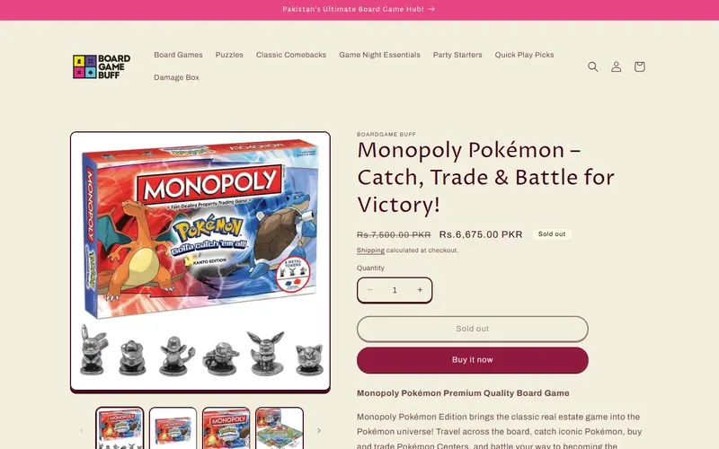 After
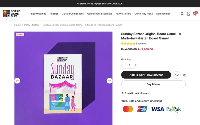
First screen of each page, desktop, as observed on 3 November 2026. Why it worksA shopper planning a few purchases is guided to add the game and keep looking, and the price is confirmed at the moment they click. Buy It Now is still there for people who only came for one game.
03 · Homepage · Desktop · Fixes: welcome text, no promises
Four store promises in place of the welcome essay
BeforeThree paragraphs of welcome copy directly under the banner.
AfterFour colored boxes: Premium Quality Games (the store says it sells 100% original games), Cash on Delivery, 7 Days Easy Returns, and Customer Support with its hours, Monday to Saturday, 10:00 AM to 6:00 PM.
Why it worksA first-time visitor wondering whether the games are genuine, whether they can pay on delivery, and what happens if a box arrives damaged gets all three answers right under the banner, in the time it takes to glance down.
04 · Collection pages · Desktop · Fixes: page visit for every game
Add straight from the grid, with the saving on the badge
BeforeBox art, name, original and sale prices, and a “Sale” badge.
AfterThe same details plus badges showing the actual saving (“-37%”) and whether a game is new. Every card has an Add To Cart button, and sold-out games show Notify Me instead.
Before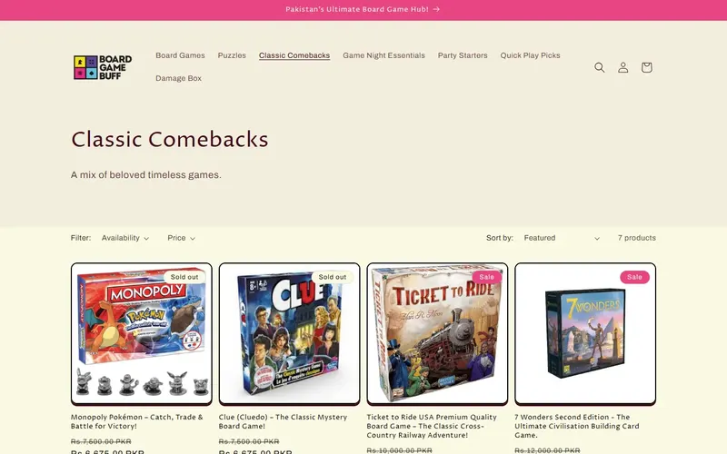 After
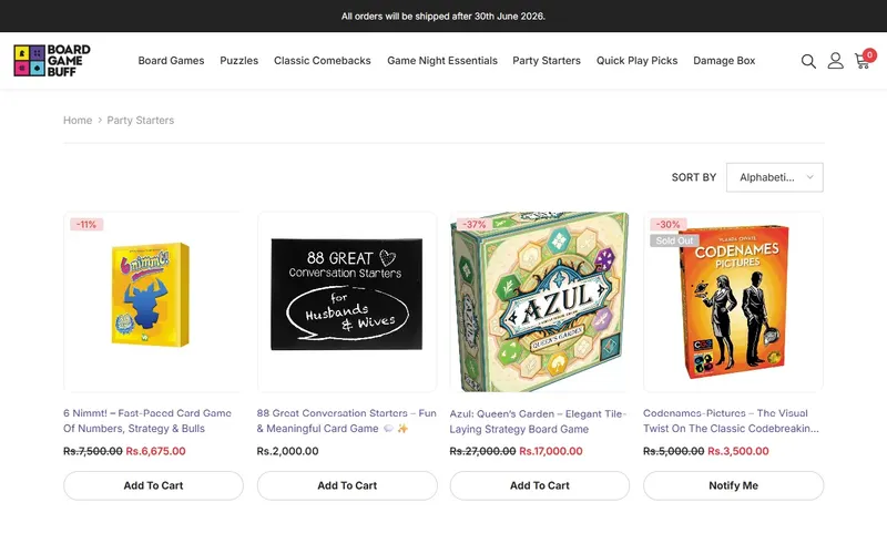
First screen of each page, desktop, as observed on 3 November 2026. Why it worksA shopper picking up Quarto, Quixo and Pylos for a strategy night can add all three from the collection page. And “-37%” tells them more than “Sale” about how good the deal is.
05 · Every page, header · Desktop · Fixes: header took too much room
A header half the height, on one line
BeforeAn announcement bar, then a header about 175 pixels tall with category links on two lines.
AfterA header about 87 pixels tall, with the logo, all eight categories and the search, account and cart icons on one line. The cart icon shows a count.
Why it worksOn every page, the games start closer to the top of the screen, and the full category list can be read in one line instead of two.
06 · Every page, footer · Desktop · Fixes: no contact details
Phone, email and address in the footer
BeforePolicy links, newsletter and social icons only.
AfterA phone number, an email address and a full street address in DHA Phase 8, Karachi, along with the policy links and the full category list.
Why it worksA shopper about to order an expensive game from a store they haven't used before can see there's a real business with a Karachi address, and a number to call about a missing piece or a damaged box.
What these changes are designed to improve
- More games per order, by making it easy to add from the grid and keep browsing.
- Fewer surprises at checkout, with prices and totals shown in the cart drawer.
- More first-time buyers trusting the store, with payment, returns and contact details visible early.
- More of each page's first screen spent on games.
Do your customers buy one item when they meant to buy three?
If your store makes shoppers open every product to add it, or hides the total until checkout, we can show you what to change first.
Get Free AuditNext store: Hijabjeez Official →
Store details describe the Board Game Buff storefront as observed on 3 November 2026; prices, products and stock change.