Case studies · Silah
Keeping a streetwear store's look while making it tell shoppers what just happened
Silah sells graphic tees, sweaters and shorts from its Aghaaz Summer'26 drop. We rebuilt the Shopify storefront so the photography still leads, but shoppers can see the categories, read product details without hunting, and know for certain when something has gone into their bag.
- Industry
- Fashion / streetwear
- Scope
- Full Shopify storefront
- Pages compared
- Header and footer, homepage, shop page, product page, cart
- Focus areas
- Add-to-bag feedback, navigation, product details, browsing
A strong drop, a small range, and photography that does the talking
Silah's store centers on its Aghaaz Summer'26 drop: ten products on the shop page, from Rs. 6,000 paneled graphic tees to Rs. 17,999 sweaters, shot in a moody, editorial style.
With a range that size, every product view matters. The store needed to keep its look while removing the small moments of doubt that stop a shopper partway through: Did that work? Where are the tops? What is this made of? Those are the moments this redesign addresses.
What was getting in the shopper's way
- 01
Adding to bag looked like nothing happened
On the Daira Paneled Graphic Tee page, pressing ADD TO BAG added the tee to the cart, but the screen didn't change. No drawer, no message, no count on the bag icon. The button just turned grey.
A shopper who isn't sure it worked either presses again and ends up with two, or leaves the page to check.
- 02
The whole menu was behind one word
The header showed “MENU,” the logo and three icons. The menu drawer held Home, About Us, Shop and Collections, with no categories like tops or bottoms. The header also scrolled away with the page.
Someone looking for a sweater had to open a drawer to find out where to start, and scroll back to the top to do it again.
- 03
Fabric and fit were one click away from view
On the product page, material and fit details only appeared after clicking a small “Product Details” link, which opened a side panel over the page.
“Is it cotton?” and “How does it fit?” are the questions a shopper asks right before choosing a size. Hiding the answers means many never see them.
- 04
The shop page opened on a photo, not products
The Products page started with a full-width banner reading “Products / SUMMER'26.” The first product sat roughly a full screen below the top of the page.
A shopper who clicked Shop wanted to see what's for sale. Making them scroll past an image first slows the first look at the range.
Four changes that remove doubt without diluting the brand
All observations are from the desktop version of each theme.
01 · Product page and cart · Desktop · Fixes: no confirmation on add
A cart drawer that confirms every add
BeforeThe item was added silently. To confirm it, a shopper had to visit the cart page.
AfterA “Shopping Cart” drawer slides in showing “1 item,” the tee with its size (XS) and an edit option, a quantity control, subtotal and total, and CHECKOUT and VIEW CART buttons. The bag icon in the header also shows a count.
Why it worksThe shopper sees straight away that the tee went in, in the size they picked, and can check out from the same spot or close the drawer and keep browsing.
02 · Every page, header · Desktop · Fixes: menu behind one word
Categories in the header, and a header that stays
Before“MENU,” logo, icons. A drawer with Home, About Us, Shop and Collections. The header scrolled off the page.
AfterHOME, SHOP ALL, COLLECTIONS (with Aghaaz), CATEGORY (with Tops, Bottoms and Sweaters), CONTACT US and LOG IN, all visible. The header comes back as the shopper scrolls.
Before After
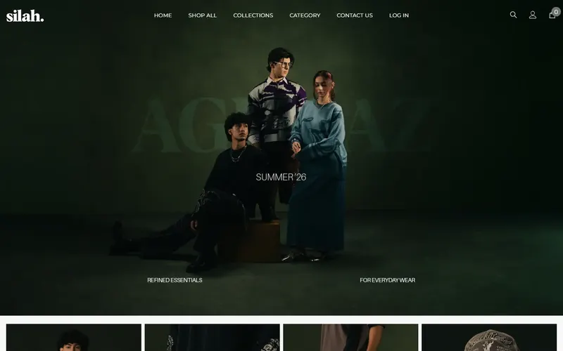
First screen of each page, desktop, as observed on 3 November 2026. Why it worksA shopper who wants something warm can go to Category, then Sweaters, from any point on the page, without opening a drawer or scrolling back up. Contact Us is one click away for anyone with a sizing question.
03 · Product page · Desktop · Fixes: details one click away
Product details in plain view, and the chosen size spelled out
Before“Select Size” with XS already highlighted, the buttons, then a “Product Details” link that opened a side panel.
AfterA breadcrumb above the product. “Size: XS” names the selected size. A “Size Chart” link with a ruler icon sits next to the buttons. Under them, a Description section lists the details directly: single jersey in 100% cotton, relaxed everyday fit, machine wash.
Before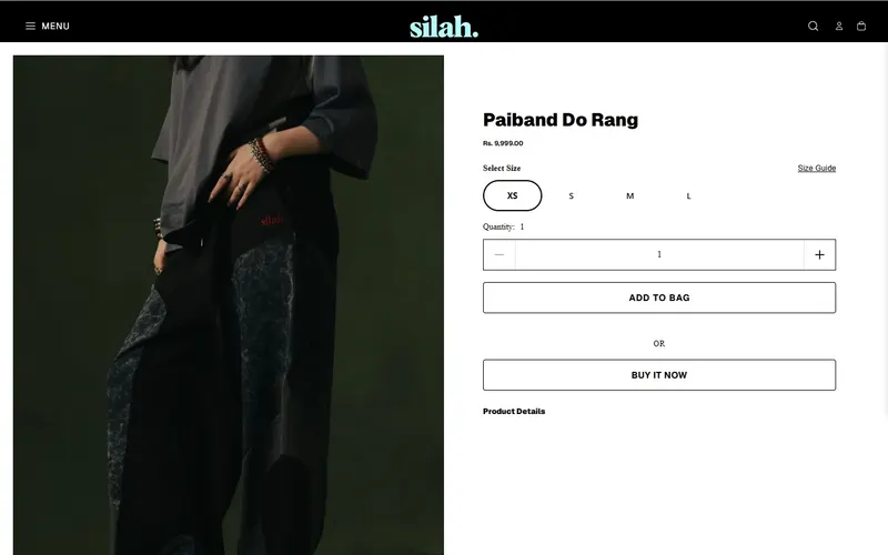 After
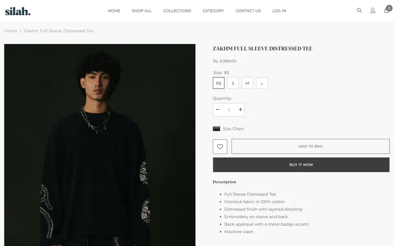
First screen of each page, desktop, as observed on 3 November 2026. Why it worksA shopper deciding between S and M can read “relaxed everyday fit” and “100% cotton” just below the size buttons, and the label confirms which size they're about to add. Fewer guesses at this step should mean fewer wrong-size orders.
04 · Shop all page · Desktop · Fixes: photo before products
A shop page that opens on the products
BeforeA full-width banner first, with the product grid starting about a screen down.
AfterThe product grid starts right under the header: four styles per row, each with its name and price.
Before After
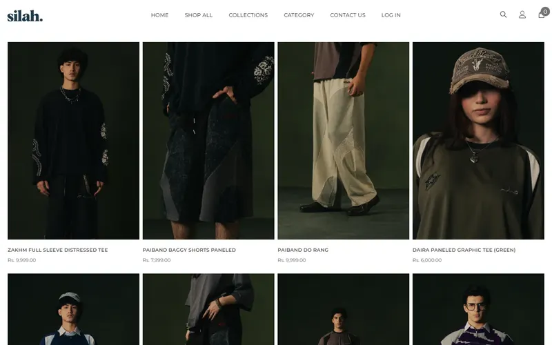
First screen of each page, desktop, as observed on 3 November 2026. Why it worksA shopper who clicked Shop All sees four styles and their prices the moment the page loads. With a ten-piece range, that first screen does most of the selling.
What these changes are designed to improve
- Fewer duplicate adds and fewer shoppers leaving the product page to check their bag.
- Faster routes to tops, bottoms and sweaters from any page.
- More confident size choices, with fabric and fit in view.
- More product views from the shop page's first screen.
Does your store look great but leave shoppers guessing?
If your add-to-cart button gives no sign it worked, or your menu hides your categories, we can keep your brand's look and fix what's slowing people down.
Get Free AuditNext store: Board Game Buff →
Store details describe the Silah storefront as observed on 3 November 2026; prices and products change.