Case studies · Super Asia
Making a Rs.96,500 washing machine as easy to buy as it is to browse
Super Asia sells washing machines, air coolers, water heaters, fans and small kitchen appliances online in Pakistan. We rebuilt the Shopify storefront so shoppers can find their category from the first menu, see a clear buying path on every product page, and get warranty and payment reassurance at the moment they commit.
- Industry
- Home appliances
- Scope
- Full Shopify storefront
- Pages compared
- Header and footer, homepage, collection, product page, cart
- Focus areas
- Buy box, add-to-cart flow, navigation, contact access
A large range, sold one high-ticket order at a time
The store's footer says Super Asia has been around since 1975, and its range runs from fully automatic and twin tub washing machines to air coolers, gas and electric water heaters, fans, water dispensers, hobs and kitchen hoods. Many of these are big purchases. The washing machine we tracked through the store costs Rs.96,500.
A shopper spending that much needs three things from the store: a fast route to the right category, a product page that makes the next step obvious, and a reason to feel safe paying online. The old storefront left gaps in all three. Our goal was to close them without hiding the depth of the catalog.
What was getting in the shopper's way
- 01
The product page pointed shoppers to the wrong button
On the SA-814i page, Add to Cart was an outlined white button, while Buy it now below it was solid blue. Nothing near either button mentioned payment methods or secure checkout.
When the secondary action is louder, shoppers who want to compare or keep browsing hesitate. And with nearly a lakh rupees on the line, silence about payment leaves a real question unanswered.
- 02
Reading the specs carried shoppers away from buying
The capacity, 14KG, sat at the top of a description with around 19 feature bullets plus specifications. Once a shopper scrolled into that list, no buy button stayed on screen.
Appliance buyers read specs to make up their minds. The moment they decide is often deep in that list, far from the button.
- 03
Adding to cart took shoppers off the product
Clicking Add to Cart sent the shopper to a separate cart page. The only note there was that taxes and shipping are calculated at checkout.
Anyone adding a second item, like a fan alongside a washing machine, had to find their way back. And the last screen before checkout said nothing about warranty.
- 04
Every category was hidden behind “Online Store”
The top menu read Home, Online Store, Customer Care, Track Order. Washing machines, air coolers, water heaters and fans only appeared after hovering over Online Store.
A shopper who arrives wanting an air cooler doesn't see the words “Air Coolers” until they guess where to hover.
- 05
No phone number for a phone-first purchase
We found no phone number in the old header or footer. Help meant a chat widget or a complaint page.
Buyers of large appliances often want to ask a person about installation, delivery or warranty before paying.
- 06
The homepage led with products shoppers couldn't buy
The first product block, “HOT SELLING,” showed four items. On the day we checked, its first item and two of the four were marked Sold Out. The promise tiles below it read “Easy shopping,” “Quick delivery” and “guaranteed 100%” with no detail.
A first-time visitor's first product impression was an item they couldn't order, followed by claims too vague to reassure.
Six changes, in order of how close they sit to the sale
All observations are from the desktop version of each theme.
01 · Product page · Desktop · Fixes: wrong button emphasis
A buy box with one clear first move
BeforeAn outlined “Add to Cart” under a solid blue “Buy it now.” Colors shown as small image thumbnails. No payment information.
AfterA full-width black button reading “Add to cart - Rs.96,500.00 PKR,” a red BUY IT NOW below, colors as labeled White and Graphite buttons, and “100% Safe & Secure Checkout” with Mastercard, UnionPay, VISA and PayPak logos.
Before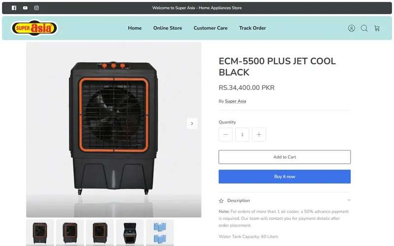 After
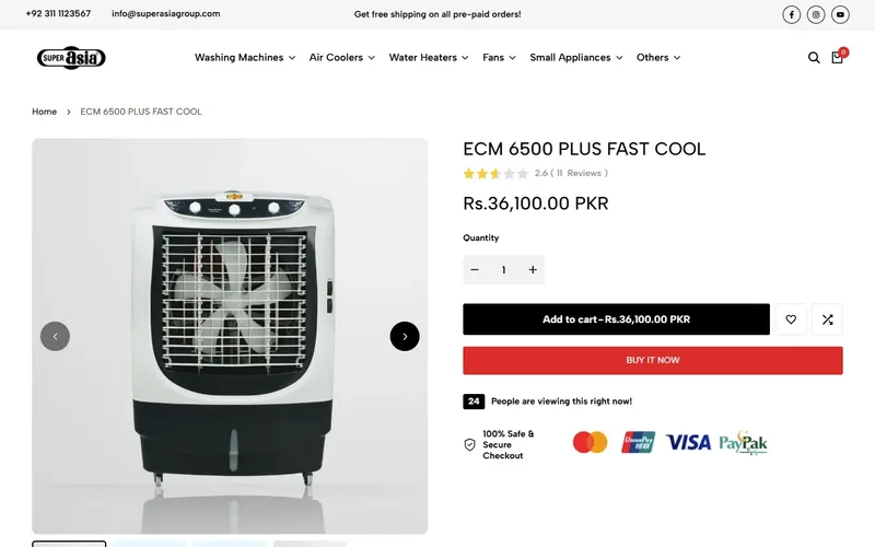
First screen of each page, desktop, as observed on 3 November 2026. Why it worksA shopper about to spend Rs.96,500 now sees the price inside the button they're pressing and the cards they can pay with, including local PayPak, directly underneath. They don't have to start checkout to find out whether their card works.
02 · Product page · Desktop · Fixes: specs pull shoppers away
An add-to-cart bar that follows the shopper through the specs
BeforeOnce the shopper scrolled into the feature list, the only way to buy was to scroll back up.
AfterWhen the main button leaves the screen, a bar appears at the bottom with the product photo, name, selected color and price, quantity, and Add to cart.
Why it worksA shopper comparing the SA-814i's child lock, water levels and drum design decides somewhere in that list. The bar lets them add it right there, with the chosen color and price confirmed, instead of hunting for the button they passed several screens ago.
03 · Product page and cart · Desktop · Fixes: cart takes shoppers away
A cart drawer that keeps shoppers on the product and mentions the warranty
BeforeAdd to Cart opened a separate cart page with the subtotal and “Taxes and shipping calculated at checkout.”
AfterA cart slides in from the side while the product stays behind it. Above the Check out button: “Genuine Manufacturer Warranty & Certified Authenticity Guaranteed on Every Order.”
Why it worksA shopper who just added a washing machine can confirm it worked and keep browsing without losing their place. Those ready to pay see the warranty promise on the same screen as the Check out button, which is where the “what if it breaks?” question tends to come up.
04 · Every page, header · Desktop · Fixes: hidden categories
Categories named in the main menu
BeforeHome, Online Store, Customer Care, Track Order. Product types only in a hover menu under Online Store.
AfterWashing Machines, Air Coolers, Water Heaters, Fans, Small Appliances, Others, each with its own dropdown of series and types. The header stays available as the shopper scrolls back up.
Before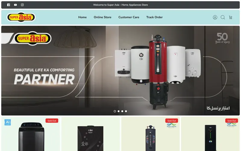 After
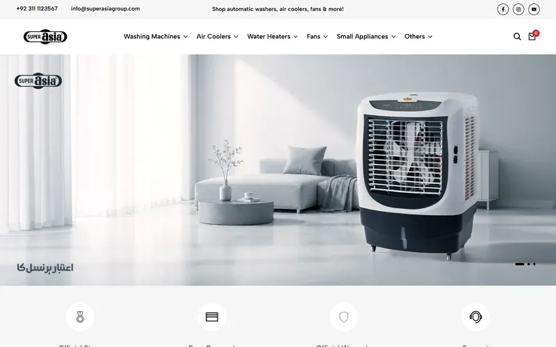
First screen of each page, desktop, as observed on 3 November 2026. Why it worksSomeone who came for an air cooler sees “Air Coolers” the moment the page loads and can go straight to Auto Inverter or DC 12V models from the dropdown. No guessing which menu item hides the catalog.
05 · Every page, top bar and footer · Desktop · Fixes: no phone number
Sales and complaints numbers on every page
BeforeA top bar reading “Welcome to Super Asia - Home Appliances Store.” No phone number in the header or footer.
AfterThe top bar opens with “For Complaints: 0311 1123345” and “For Sales: 0311 1123567.” The footer adds the G.T Road, Gujranwala address, an email address and both numbers.
Why it worksA shopper unsure whether a water heater suits their gas line, or when delivery will arrive, can call sales from whatever page they're on. Separating sales from complaints also tells existing customers where to go, so pre-sale calls aren't stuck behind service issues.
06 · Homepage · Desktop · Fixes: sold-out first impression
A homepage that routes to categories and spells out its promises
BeforeUnder the banner, a four-item “HOT SELLING” block led by a sold-out product, then tiles reading “Easy shopping,” “Quick delivery,” “guaranteed 100%.”
AfterDirectly under the banner, four promises with a line each: Official Store, Easy Payment, Official Warranty, Support. Then “Shop By Collections” photo tiles for each category, followed by product grids for Air Coolers and Water Dispensers.
Before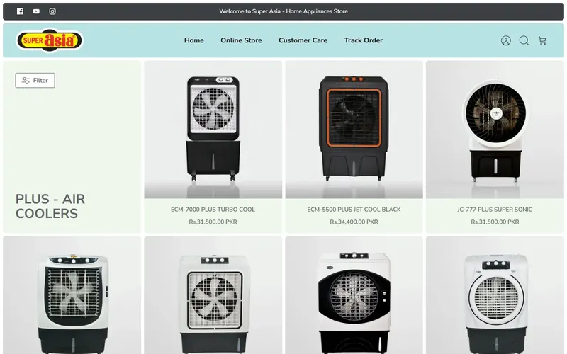 After
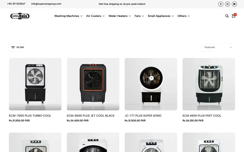
First screen of each page, desktop, as observed on 3 November 2026. Why it worksA first-time visitor learns, before scrolling far, that this is the brand's own store with an official warranty, then picks a category by photo. Their first product impression is a range they can browse rather than an item they can't order.
Smaller fixes along the way
- A breadcrumb above the product title, so shoppers can see where they are.
- The sort menu sits on the collection page instead of inside the filter drawer.
- Filters now include product category and availability, with an item count for each option.
- Sold-out products are marked with a clear overlay on the product photo.
- Color options on collection cards are named (Black, White, Graphite).
- Collection cards offer quick add, wishlist, compare and quick view on hover.
- The product description moved into a wide tabbed panel with larger, easier-to-read text.
- The footer's quick links now list each product category.
What these changes are designed to improve
- More shoppers reaching the right category from their first click.
- Fewer shoppers leaving a product page after reading the specs without adding to cart.
- Shoppers adding a second appliance without losing their place.
- Fewer payment and warranty doubts at the point of checkout.
- An easy route to a person for buyers who want to call before they pay.
Do your best products ask for a big decision?
If your product pages leave shoppers unsure which button to press, or quiet about payment and warranty right when they're ready to buy, we can show you where the gaps are.
Get Free AuditNext store: Silah →
Store details describe the Super Asia storefront as observed on 3 November 2026; prices and stock change.