Case studies · Tavozza
Giving a marble furniture brand a storefront that shops like a catalog
Tavozza makes side tables, coffee tables, lighting, décor and bathroom pieces in its own marble, sold online in Pakistan. We rebuilt the Shopify store so shoppers can go from the menu straight to the exact type of piece they want, compare options with ratings in view, and check out without extra hoops.
- Industry
- Furniture and home décor
- Scope
- Full Shopify storefront
- Pages compared
- Header and footer, homepage, collection, product page, cart
- Focus areas
- Navigation, product browsing, checkout path, trust details
A design-led brand with a growing range
The old store described Tavozza as drawing inspiration from Italy's luxury brands, with pieces made from its own Tavozza marble. The furniture collection alone held 38 products, from Rs.17,800 side tables to console tables above Rs.2 lakh, many offered in several marble and wood finishes.
With prices like that and so many combinations, shoppers need to narrow down quickly, see what other buyers thought, and feel the brand is established. The old storefront made each of those harder than it needed to be. Our goal was a store that lets the product range do the selling.
What was getting in the shopper's way
- 01
The menu led away from the store
The first menu item, “2026 Collection,” opened a PDF catalogue. Furniture, Lighting, Decor and Bathroom linked to separate landing pages, and side tables, coffee tables or consoles weren't named anywhere in the menu.
A shopper who wants a console table can't go to one. And a PDF is a dead end: no prices to compare, no add to cart.
- 02
38 tables and no way to narrow them down
The Furniture collection showed all 38 products on one long page. We saw no filter or sort control above the grid, and the cards showed only a photo, name and price.
Shoppers had to scroll through everything to find their price range, with nothing on the card to tell them which pieces other buyers rated well.
- 03
An extra step and a covered button at checkout
The cart drawer asked shoppers to tick “I agree with the terms and conditions.” A floating call widget sat over the bottom of the drawer, where the checkout button was.
The last screen before payment is where every extra tap and every obstruction costs the most.
- 04
Strong reviews, shown too late
On the Afro Side Table page, the 7-review star rating sat below the Add to Cart button and four policy links. The long description ran in a narrow column, leaving the space under the gallery empty.
Shoppers weighing a Rs.17,800 table look for proof early. Burying it under links means many decide before they see it.
- 05
No way to reach the business from the footer
The footer had a “More To Know” heading with no links under it. We found no phone number, email, address or policy links there.
Before paying for marble furniture online, shoppers often want to know there's a real business they can contact if something arrives damaged.
- 06
Template placeholder text on the homepage
The homepage's “Explore” section showed three cards titled “Your post's title” with demo illustrations, plus Shopify's note that the store hadn't published any blog posts yet.
For a brand positioned around craftsmanship, leftover template text tells a careful shopper that nobody is looking after the details.
Six changes, from the first click to checkout
All observations are from the desktop version of each theme.
01 · Every page, header · Desktop · Fixes: menu led away from the store
A menu that names every type of piece
Before2026 Collection (a PDF), Furniture, Lighting, Decor, Bathroom, mostly linking to landing pages.
AfterSale, New, Sofas, Furniture, Lighting, Home Décor, Kitchen, Bathroom, Pets. Furniture opens Center Coffee Tables, Side Tables, Console Tables, Nesting Tables and Dining Tables, each a shoppable collection. The PDF link is gone.
Before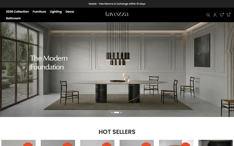 After
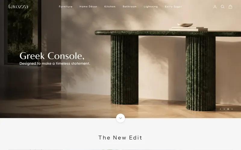
First screen of each page, desktop, as observed on 3 November 2026. Why it worksA shopper furnishing a hallway can hover Furniture and click Console Tables, landing on a product grid with prices. No PDF to download, no landing page to scroll through first.
02 · Collection pages · Desktop · Fixes: no way to narrow down
Collection pages built for narrowing down
BeforeOne Furniture page of 38 products. No visible filter or sort. Cards showed photo, name and price.
AfterFocused collections, such as Side Tables with 18 products. A bar shows the product count, a Sort by menu, and a Filter panel for availability and price. Cards add star ratings with a score, like (4.9), and color swatches for each finish.
Before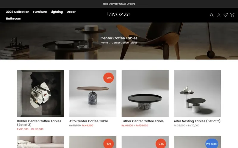 After
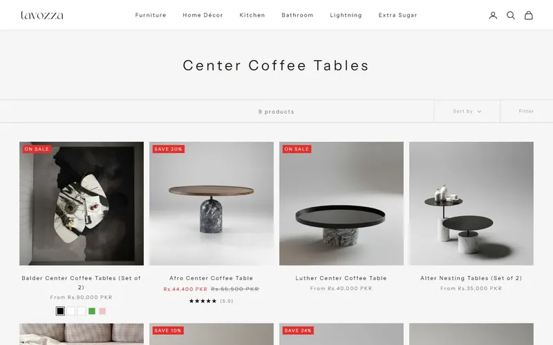
First screen of each page, desktop, as observed on 3 November 2026. Why it worksA shopper with a Rs.25,000 budget for a side table can set a price range and sort, then pick between well-rated pieces at a glance. The swatches show which finishes each table comes in before they click.
03 · Cart drawer · Desktop · Fixes: extra step at checkout
A cart drawer with one clear way out: Checkout
BeforeA terms checkbox above the buttons, a call widget floating over the bottom of the drawer, and the checkout button at the very bottom.
AfterThe item with its finishes (Brown Wood / Carrera White), a quantity control, an optional order note, and a full-width Checkout button with nothing on top of it.
Why it worksA shopper who has just picked their finishes and added the table is at their most ready to pay. Now the next step is the only big button on screen, with no box to tick and nothing covering it.
04 · Product page · Desktop · Fixes: reviews shown too late
Reviews next to the name, options next to the details
BeforeTitle, price, finish options, Add to Cart, four policy links, then the 7-review rating. Description in a narrow column, with a compact bar for buying once the shopper scrolled.
AfterThe star rating and “7 reviews” sit right under the title, before the price. The description fills a wide column under the gallery while the full finish buttons and Add to cart stay in view beside it.
Before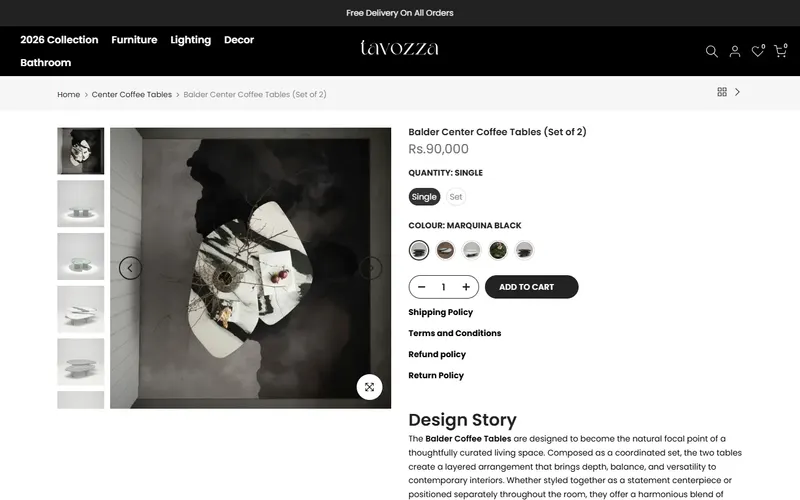 After
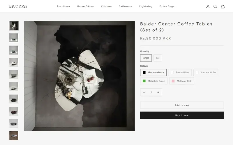
First screen of each page, desktop, as observed on 3 November 2026. Why it worksThe first thing a shopper reads after the table's name is that seven buyers rated it highly. And while reading the dimensions or care notes, they can switch from Carrera White to Marquina Black right there and see the change, instead of using a small dropdown in a bottom bar.
05 · Every page, footer · Desktop · Fixes: no way to reach the business
A footer that shows who's behind the store
BeforeA brand paragraph, an empty “More To Know” column and a newsletter signup.
AfterA phone number, email, and an address in DHA Phase 4, Lahore, plus links to About Us, Privacy Policy, Return Policy & Refund Policy, Shipping Policy, Terms & Conditions and Contact Us.
Why it worksA shopper about to order a marble table online usually checks the footer for an address and a return policy. Now both are there, along with a number to call about delivery or damage.
06 · Homepage · Desktop · Fixes: placeholder text
Real journal posts in place of template filler
BeforeThree “Your post's title” cards and Shopify's “no blog posts yet” message.
AfterA “Tavozza Journal” section with real articles, such as “Dining Space That Brings People Together.”
Why it worksA visitor who scrolls to the bottom of the homepage now finds writing about how the pieces fit into a home, rather than signs of an unfinished site. For a brand selling on design, the details around the products have to match the products.
Smaller fixes along the way
- Homepage product rows are grouped by category, including a “Best Selling Tables” block with tabs for nesting, coffee and side tables.
- Star ratings appear on product cards across the homepage, not only on product pages.
- Finish options on product pages are larger, labeled buttons.
- Product dimensions sit in a clear table in the description.
- A Buy it now option was added beside Add to cart.
- The footer adds Pinterest, YouTube and TikTok links alongside Facebook and Instagram.
What these changes are designed to improve
- More shoppers reaching the right product type from the menu instead of a PDF.
- Faster shortlisting in larger collections, by price and by rating.
- Fewer shoppers stalling in the cart before checkout.
- Reviews doing more of the persuading on product pages.
- More confidence that there's a real, reachable business behind the store.
Is your catalogue bigger than your menu?
If shoppers can't get from your homepage to the exact thing they want in a click or two, or your best reviews sit where few people see them, we can show you what to change first.
Get Free AuditNext store: Super Asia →
Store details describe the Tavozza storefront as observed on 3 November 2026; prices, products and stock change.